
A UX Case Study of Ordering A Double Whopper Burger
It was my birthday last week and while I usually stay strict with my paleo diet (not consuming basically anything that I don’t cook myself from fresh ingredients) I felt like treating myself to a burger. I say to myself, ‘It’s a once a year thing so who cares about eating healthy right?’
I love a good flame grilled burger and when I saw that Burger King delivers my mouth started to water. I went and ordered my meal and come stuck a few times during the process so I thought this would make a good UX case study.

On initial visit of the site we see the main call to action asking to enter our post code. All is simple at this stage. You enter your address details, it finds the nearest store and then you go to the next stage of ordering your meal.
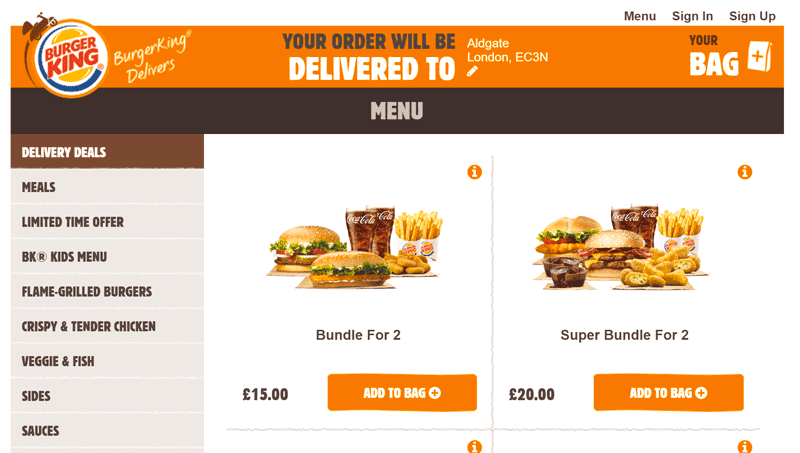
At this stage you only have one option of navigating through the menu using the left sidebar. Nowhere could I see any option to filter food by price, dietary recommendations etc. This was a bit of a let down. The full menu (which you can download as a pdf) clearly shows all the dietary information and allergy advice, is it really that hard to add this into a filter?
As we saw in our recent usability study of 50 of the top online stores 40% allowed the user to filter by product specific filters. Burgers should be no different.
Selecting the Flame-Grilled Burgers option in the menu we then get taken to the listing page. Again no filters, but at least the pricing is shown clearly for each burger. This is important as to get your food delivered you need to reach a minimum total order value of £14.
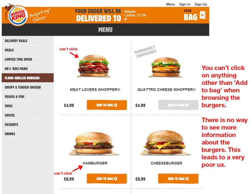 For some reason the ‘More Information’ tool tip that was on the previous page has disappeared from the interface. There is no obvious place to click to get more information on the individual burgers. I guessed that you just clicked on the burger to see more information. I was hoping to find a full list of ingredients as I don’t eat burger king often and didn’t know what was in each burger. Clicking the images did nothing. Clicking the title of the burger did nothing…..
In fact there was no way to see information about each burger. I couldn’t believe how badly designed this was. I had to open up the normal burger king website, go to their menu section and click on each burger to get information about it. Even then some of the information on the burgers was very bad. No list of ingredients….could they be serious? How on earth can you sell food and not list what is inside it!
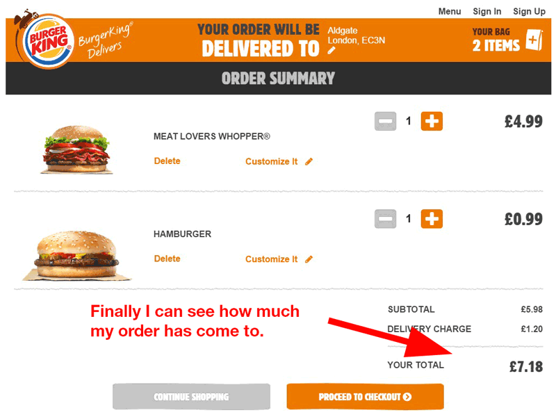
After 10 minutes of going backwards and forwards between the 2 sites we knew what we wanted to order. There was another problem….we couldn’t see how much was in our cart so we therefore did not know whether we met the minimum order value.

We had to click into the cart, see the order value, realise it didn’t total £14, go back to the menu on the original burger king site. Find another burger we wanted and then go into burgerkingdelivers and add that to our cart.
It was an incredibly long, annoying ordering process and something I thought a huge corporation such as burger king would get right.
Fortunately I was really craving for a burger so I stuck with it and finally completed the order. It just goes to show that even the biggest brands can easily get the user experience wrong.
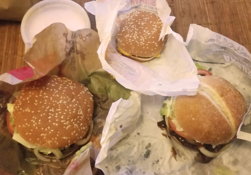
Was it worth it? YES! The Whoppers were delicious!
Would you like us to rip apart your site and user experience? Check out our Website Review Service if you dare.
About the author
Paul Manwaring: This is where we share a thoughts, tips and research into the world of marketing, design and business. Be sure to follow us on Twitter and Facebook.
Would you like to share your thoughts?
Your email address will not be published. Required fields are marked *