
A quick UX review of UsePanda’s onboarding process
From time to time I pick an app at random from ProductHunt and review it. Mostly out of my own interest but to also help you understand how you might design your future product. Lets jump in and see what we got!
Welcome Page

- Short and to the point description, could maybe explain how it’s going to make my life easier or what problem it’s trying to solve.
- Nice to see the app in action in the right area of the page. See this being used a lot on app websites now. It not only allows to show the user the app in action right off the bat but also make the page interesting and more engaging in my opinion.
- Nice we have the option to try the app on the web or download. I prefer on the web as my sdd drive is getting full very quickly! CTA buttons stand out nicely against the blue background.
What we learnt: Interactive landing pages can make a more engaging experience. You shouldn’t need a lot of test to explain a product.
Sign Up

- Nice graphics and great we have 2 options to get started. One connecting to twitter which will import all the websites we follow or the manual option.
Page 3
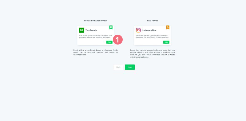
- It would have been nice to have some sort of title on this page so I know what I’m looking at. My first reaction was to click on the ‘Add’ button on the TechCrunch box as I thought it was asking if I wanted to follow it. Turn’s out these were just images and explaining what appears to be 2 different types of cards.
I only figured this out after browsing the site, once I realised I couldn’t click on the ‘Add’ button as initially thought I just clicked on next and didn’t pay too much attention to what it was saying.
What we learnt: Try to avoid adding things that look like buttons on the page when they cannot be clicked. It can confuse the user.
Customization Page

- The cards now made sense in that I could click on the ‘Add’ button to include them in my Panda Feeds. I still didn’t get what the small banners were on the cards. Clicking on them bought up the same information from the previous page and it clicked.
Dashboard
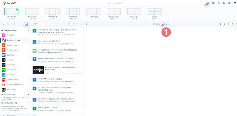
- Hurray as dashboard that doesn’t just leave me stranded! While I liked the different view options at the top of the page (I wish more dashboards had templates like this). I really liked the little radar blips at various points on the page that gave me tooltips to instruct me of features on the dashboard.
What we learnt: Always guide your user through your dashboard on first visit.
About the author
Paul Manwaring: This is where we share a thoughts, tips and research into the world of marketing, design and business. Be sure to follow us on Twitter and Facebook.
Would you like to share your thoughts?
Your email address will not be published. Required fields are marked *