
Category Page Usability: Helping Your Visitors Browse More Easily
Category pages are very important to any ecommerce store. Imagine them as an isle in a supermarket, full of products, brands, prices all fighting for the viewers attention. If your category page fails to allow the user to quickly and easily make an informed decision they’ll be more likely to leave your website and go somewhere else. How can we help a user navigate through this jungle of information and products?
To answer this question we analysed 50 of the most popular ecommerce stores on the net. We visited each site and went through the process of browsing for a product and trying to narrow down our results to a selection of 3-5 options. We wanted to see how easily these sites allowed users to find the product they wanted. To name Just a few of the sites used in this test:
- Net-A-Porter
- Amazon
- Home Depot
- Sports Direct
- Macys
- Made
- Wiggle
The main aim of any category page is to help the user get from a large selection of products to a refined selection of products and ultimately get them to visit the individual product page to make a purchase.
While it may sound simple you would be amazed how many small business ecommerce sites that I test do not feature even the most basic functions to assist a user.
So lets take a look at some of the key issues facing category pages and how the top ecommerce stores deal with them.
Default Sorting Option
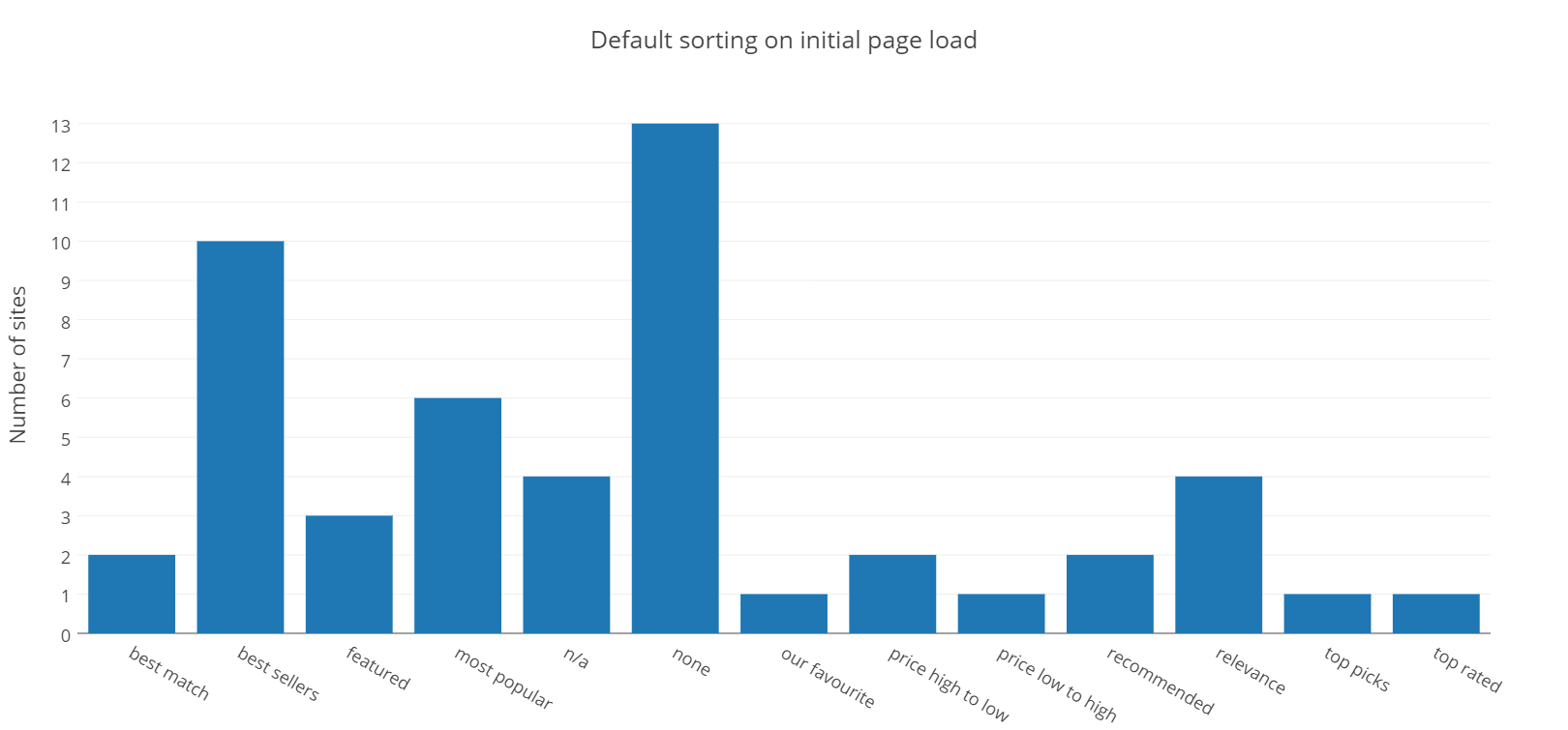
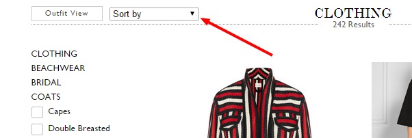
It was interesting to see how the various sites initially sorted their products when a user landed on the page. What was most interesting was that most sites did not show a default sorting option. Many just left it up to the user to decide. Here is one example from Net-a-Porter.
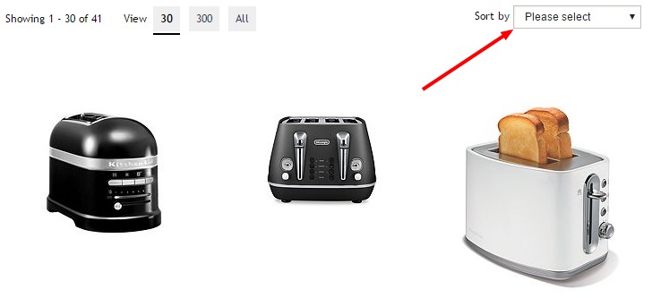
Here is another from House of Fraiser.
The sorting that is placed on the products on the initial page load cannot be replicated by any of the sorting options from the sort by dropdown either. The only conclusion I can come to why so many retailers choose this option is so they do not come across like they are influencing your buying decision.
On /r/userexperience subreddit I asked this question and received a few great answers. Some of the theories of what the sorting could be were as follows:
- Products that they want to move off the shelves (perhaps its coming out of season soon).
- Best Selling
- Most Recent (item id number)
The second most popular default sorting was ‘Best Sellers’. A safe choice for sorting as usually the best selling product are what most visitors will be looking for (hence why their best sellers). It also give’s the impression that people are buying your products and liking them. Something important to put across for new websites.
Where is the sorting placed on the page?
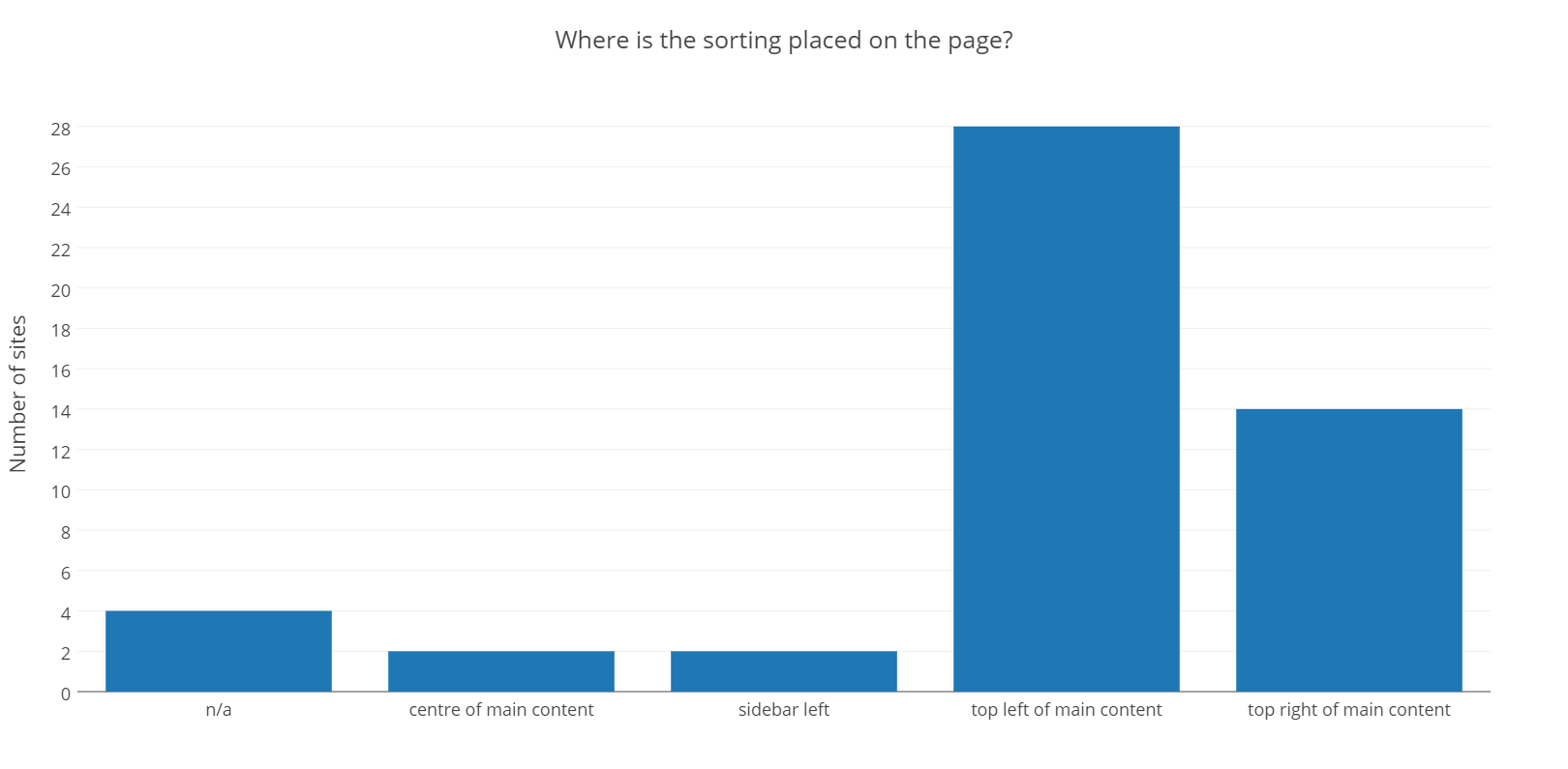
Placing your ‘Sort By’ dropdown menu in an easy to find location is essentially to a customers shopping experience. The most popular location was top left of the main content column. This makes sense seeing as we typically start in the top left of the page. Numerous eye study tests have shown users view a page in an ‘F’ shape. Starting at the top left and moving across and down.
![]()
The majority of these ecommerce sites placed their sorting at the top of the main content. Always above products and either left or right of the main content column.

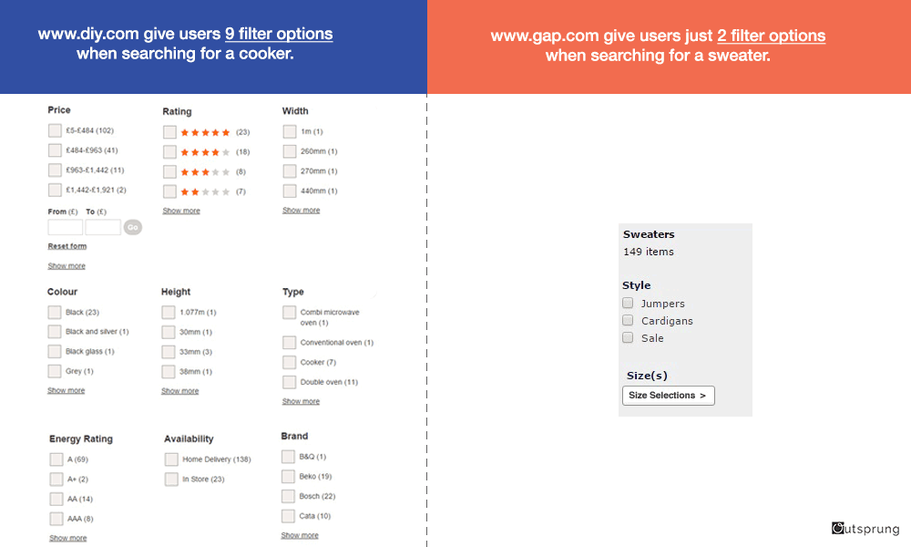
Filter Options
From our website review service we test a lot of ecommerce sites. One of the most common problems I see with filters is that they do not allow enough customisation. Having a limiting set of filters will only frustrate the user and lower their chances of finding a suitable product. Especially if you have a large inventory.
We categorised the filter options into 3 common groups; price, features (preferably category specific) and rating. It’s worth noting that all of the fashion website did not show ratings. I suspect this is because someone’s fashion tastes are individual and liking a design/colour/pattern is largely subjective. The more functional clothing lines that I have reviewed in the past do allow reviews.

As we can see most website either included features, price or ratings in their filter options. By features we mean category specific features, so if you were looking for a sofa for example you would be able to filter by “2 seater”, “3 seater”, “Leather”, “Polyester” and so on.
Let’s take 2 examples of websites, one can be considered very good in terms of filter option and the other very limiting. At the very least gap.com could include colour, material, and even specific body part measurements (neck, sleeve etc) to it’s filtering.
Add & Subtract Multiple Filters At Once?
I hate it when I come across a site that only allows me to select one filter at a time. As we can see from the results below 86% of the sites tested allowed me to select more than one filter at a time. The reason for this is simple; to help the user refine their search results. Fortunately most ecommerce platforms have this feature built in.

Where are the filters placed on the page?
78% of sites tested placed their filtering options on the left side of the page.

Ikea take the different (worse) approach and place their filters top left of the page. I do not like this layout as you see it takes up quite a lot of space (look at all that empty space in the filter bar) and pushes the products further down the page.

Does The Page Show Ratings?
We touch upon this on the filter section but I thought it would be interesting to see how many sites showed a star rating on the page. It worth noting that ALL fashion sites we tested DID NOT show ratings.
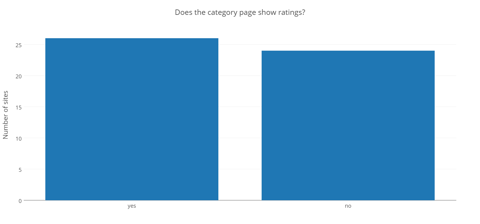
Ratings are incredibly important, try to think back to the last time you purchased a product online without reading a review first…I don’t think I have ever done so. A problem I see with many of my clients is this catch-22. Without reviews, visitors are less likely to buy, but you need visitors to buy in order to get reviews.
If you have a new product think about reviewing the product yourself or provide video demonstrations to place on your product pages. Even better, directly compare it to the competition to show the visitor your product truly is the best option. You can also use sites such as Tomoson which connect products to relevant bloggers who will review the product for you.
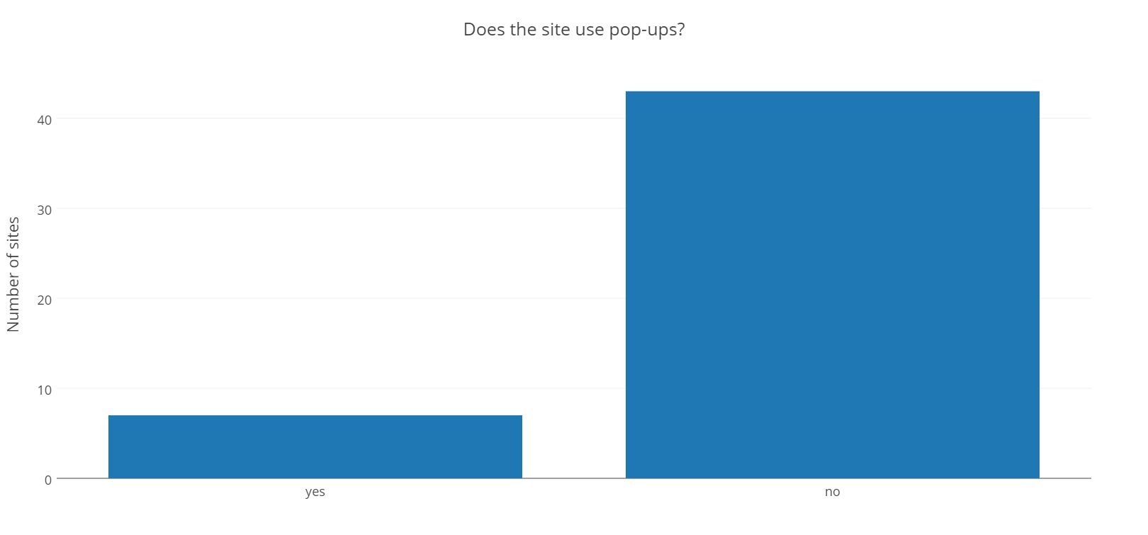
Did the site use a pop up?
While pop ups may be becoming more popular with blogs and content based sites especially with less intrusive technology such as scroll mats, slide in’s etc. They are still largely a big no-no for ecommerce sites.
Hover over product images

I personally really like hover over effect on thumbnails. They allow the user to view the product from a different angle when simply hovering the mouse over the thumbnail. This is very effective for ecommerce stores, especially fashion stores where a simple hover with your mouse will show how the garment looks from the front and back.
While more sites did not have this function I think we will see more sites adopting this feature. Especially fashion or any sort of product that users will want to see 360 degrees.
Conclusion
Hopefully you have learnt a few best practices by reading this, but remember they are just best practices. Nothing is set in stone. To really test these out you need data, so don’t just implement these and forget about them, constantly test and tweak
- 86% did not use pop ups.
- 40% utilised hover over to change image on thumbnails.
- 52% displayed ratings (almost all non fashion sites displayed ratings).
- 56% placed the ‘Sort By’ drop down in the top left of main content column.
- 81% placed their filter option in the left sidebar.
- 96% allowed multiple filters to be used at the same time.
- 80% allowed user to filter their products by features, price and/or rating.
Resources
There are plenty of tools and platforms that can help you improve your ecommerce sales and user experience. Firstly I would highly recommend Shopify if you are looking for a hosted solution to build your own online store. It’s feature rich and will allow you to create a great looking and easy to user store. If you want to host it yourself one of the highest rated platforms is Woocommerce, a wordpress plugin that will give you a huge amount of features. There are also loads of themes that support woocommerce.
If you are looking to get a deeper understanding on your visitors and website I would recommend Kissmetrics, it’s a great analytics tool which will allow you to do many things such as; see your average cart size, how many times someone visited before buying something, highlight products that cause drop-offs in your funnel and much more.
Hotjar is another great analytics and feedback tool. I’m seriously liking it since I signed up to their beta. You can use surveys, visitor recordings and heatmaps to improve the user experience.
About the author
Paul Manwaring: This is where we share a thoughts, tips and research into the world of marketing, design and business. Be sure to follow us on Twitter and Facebook.
Would you like to share your thoughts?
Your email address will not be published. Required fields are marked *