
Dear Mailchimp, Please Fix Your Pricing Page
This UX critique is based on already being signed up to the Mailchimp service and trying to find information about the upgrade features. If you can’t be bother to read check out the video detailing the problem at the bottom of the post.
The Real Life Scenario
I have been a long time user of Mailchimps free plan, and I really like their service. I have noticed the Automation link in the header numerous times and after hearing so many good things about email automation I decide to see how I can start using these features in Mailchimp. I click on the ‘Automation’ link and decide to check out the features and hopefully go on to purchase.
What Actually Happened
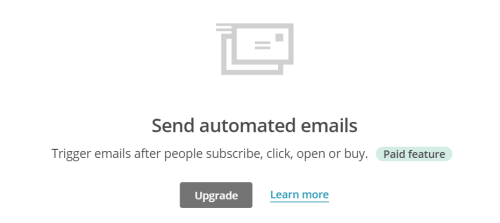
After clicking on the automation link in the top menu I read a short and sweet explanation, sounds pretty cool! I see that it is a paid feature and I must upgrade to access it. I click on upgrade.
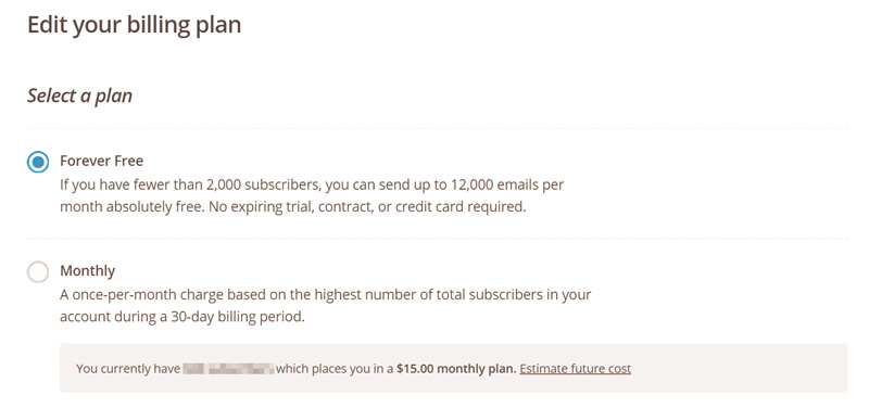
I now get taken to the pricing page/upgrade page. Here is where it starts to fall apart. Firstly nowhere is Automation mentioned on this page. NOWHERE. It seems to be quite a big feature that Mailchimp are trying to sell (and rightly so because automation rocks!) that they put it up in the main menu. Why not mention it anywhere on this page?
Next there isn’t really any information about what you get for upgrading. The only selling point that appears on this page is that I can have more subscribers….
So How Should A Pricing Page Be Designed
As you would imagine, I test a lot of pricing pages. It seems that most follow the tried and tested layout utilizing a pricing table to help the visitor compare packages and products. This layout of pricing tables are effective because of 2 things:
They force the information to be as condensed and minimal as possible. Usually you’ll just be presented with a one line description about a feature and then a tick to tell the user when it applies to that package or not. It’s very easy for the user to get an answer to a question this way.
Second, pricing tables place the packages in columns side by side. This allows information to be quickly scanned and compared.
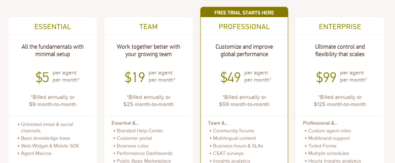
Zendesk is a good example of a pricing page. The pricing is clearly visible for each package and they manage to highlight the key features of each package by following on from the lower package features.
For most websites I don’t really come across too many ux problems because they mostly follow these 2 crucial criteria. Unfortunately Mailchimp has adopted a completely different sh*t storm of a design in my opinion. As a real life user of Mailchimp, who wanted to upgrade his package (phrasing) I was actually put off from purchasing a few weeks back because the pricing page did not answer my questions.
Maybe You Are Just Being Stupid
Yep, could be. These UX case studies are more for just getting my thoughts down only paper more than anything. I would guess I’m not the only person who has had this problem though.
Now, to be fair, Mailchimp’s pricing page for non registered users is a much clearer and yes they do go into detail about automation etc. The problem is as a registered user I never come across that because because I am always logged into the dashboard.
Now if my subscriber growth was a lot higher then my time between being a non registered user, viewing the original pricing and page and then needing to upgrade might have been shorter therefore I might have known the automation comes with the upgrade. Unfortunately my subscriber growth is not that and therefore I do not remember.
Lesson learned: Grow your email list quicker! Yes you reader, SUBSCRIBE!
How Can This Be Fixed?
There are a few things we can learn from this:
- Do not assume registered users know your features and packages by memory.
- If you are selling a feature that costs money, be sure to mention that feature in the pricing page.
Here’s a quick 5 minute screencast to show the problem in full:
About the author
Paul Manwaring: This is where we share a thoughts, tips and research into the world of marketing, design and business. Be sure to follow us on Twitter and Facebook.
Would you like to share your thoughts?
Your email address will not be published. Required fields are marked *