
3 Things We Can Learn From Basecamp UX
For a client I recently reviewed their project/team management app against basecamp. This was the first time I was using basecamp and as a long time Asana user I must say, I was really impressed with it. There were quite a few nice touches that Basecamp have in their product and in this UX review I’ll be going over some of the things I loved using. Hopefully you’ll discover some tips when designing your next app or interface.
Project management apps (or any app for that matter) can sometimes be complicated beasts. Feature-rich is a great thing but if your UI is poorly designed things will quickly turn ugly for an end-user.

The sign-up process for Basecamp is incredibly straight-forward, I won’t talk about it here as it’s pretty standard. Where things get good is Basecamp’s initial welcome screen. It’s something that I have never encountered before when signing up to an app but its something I really like the idea of.
Basecamp allows the user to play with a sample dashboard that is already pre-populated with content. This is actually really handy because it fleshes out the entire app and allows the user to see what the interface looks like at its full capacity so-to-speak. This allows the user to try out all of the functions within the app.

To accompany this, basecamp also includes a quick 2 minute video walkthrough. It’s short enough for me to be bothered to watch which was good. I hate watching through long tutorials.
What we learnt: Allow the user to learn about your product through different ways. Some examples:
- Hands-on fully fleshed out dashboard
- Video tutorial and…
- Good ol’ written manual.
User Onboarding

Once you have played around with the demo dashboards you get a good sense of how things work. I felt a lot more comfortable creating my own basecamp dashboard now. Basecamp does everything right with their user onboarding process here. I found it really helpful that they worded the field boxes as questions. It makes a lot more sense to be asked a question instead of just have a random title placed above a text field.
To further clarify the information they want from the user basecamp provide a followup description and also some examples.
Question – Explain What The Question Is For – Show An Example of an Answer.
This avoids any confusion about what basecamp needs from the user.

Once completing the rest of the signup process you get into your own dashboard. Basecamp use simple animations to direct the users attention to the area they want. Clever little animations like this and things such as highlighting and darkening the rest of the screen can really help direct the users attention to where you want it to. Especially helpful when landing on a dashboard for the first time with many things to click.
It goes without saying, don’t just dump a user into a dashboard without any guide or introduction on how to use it. Simple dashboards can probably get away with this but complex systems will usually need some sort of instruction.
Allow users to access data easily
What I REALLY liked about basecamp was that they created ready-made templates to access what they thought were the most important reports a user would need. I think they got it perfect with the following list of report templates.

Another great ux design I encountered while adding a few tasks and scheduling events was that everything felt like it was within easy reach. I managed to easily complete these tasks without watching or reading any tutorials. The flow to completing actions had been carefully thought out. As you can see another app hides these functions within the options settings which on my first use went unnoticed and left me wandering how the hell I assign the task to a team member.

 Now this might not necessarily be wrong, the app could be designed to create quick to do lists. Having lots of options here would unnecessarily clutter the process. Unfortunately in this scenario it was actually wrong because the app was trying to be a Basecamp alternative.
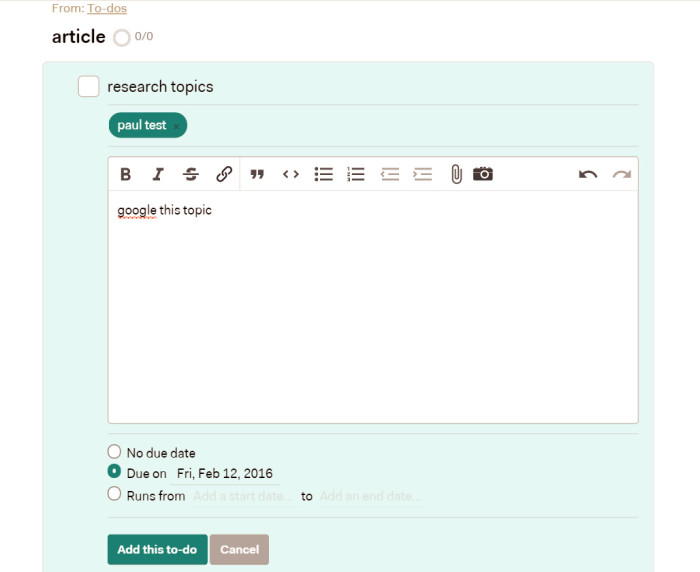
This is where it’s painfully important to understand who your typical user is through research and building personas. Basecamp is for teams, so when setting tasks you’ll likely want to assign it to someone. Making these options within easy reach create a much better user experience.
It’s simple when you read it like that but it’s making that distinction for every process in your product that will create a more holistic user experience.
Aside from that Basecamp is pretty much the same as many other team management apps, you can set tasks, schedule meetings etc. It does it all very well but I won’t drag out the article going over every single feature that is standard across other apps.
If you are looking for a team management app I’d highly recommend it.
About the author
Paul Manwaring: This is where we share a thoughts, tips and research into the world of marketing, design and business. Be sure to follow us on Twitter and Facebook.
Would you like to share your thoughts?
Your email address will not be published. Required fields are marked *